
Today’s challenge has a focus on seeing what’s intuitive or frustrating about a website or app I normally use. I’ll be using the budgeting app EveryDollar. To start, I want to highlight that the goals of this app is for budget tracking and seeing at a glance where your money is coming from and going to. Another note, budgeting is assigning “every dollar” a name before you spend it, not tracking after you spend, and this app is designed to work on that level.

I’m starting by creating an example budget on my own account for the month of February in 2019 (since I haven’t budgeted out that far yet). I think this screen is pretty great because most people’s expenses will about the same in back-to-back months. If this user isn’t used to budgeting yet, it also helps them create their foundation for a few months out while they get the hang of it.
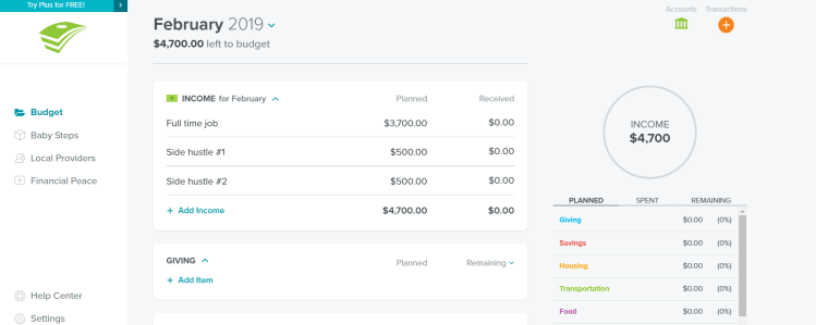
The median income in the US is $56k/year, and broken down after tax, that’s about $3,700/month. Another stat shows 38% of Americans have one or more side hustles, so I added that in here as well. EveryDollar makes it VERY easy to quickly see what you exact income is and notes at the top left how much you have left to budget for the month.
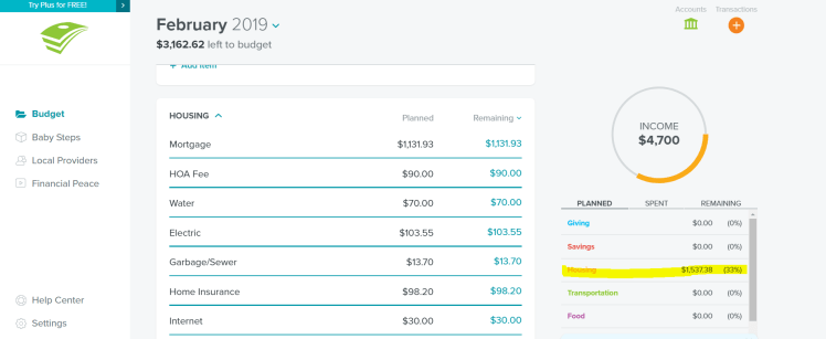
I filled out the housing budget using averages again, and I love that EveryDollar shows you the exact amount and percentage (highlighted in the lower right). As more categories get filled in, having the pie chart with highlighted colors for different budget categories is also helpful to the user at a glance. Note again that our “left to budget” amount has also been updated. When you’ve filled out every penny, (see below) the “left to budget” changes to a “It’s an EveryDollar Budget!” exclamation point and all. The user also knows that this is the ultimate end goal for this tool because there’s a green check mark beside it that symbolizes “complete”.

Say the user is more visual and doesn’t *feel* where there money is going. Housing costs and debt are most static month to month, so the next category where this user is spending the most money is their food. They are now able to adjust their budget for the month going forward and tell their money to go where it matters most to them (the end goal of budgeting).
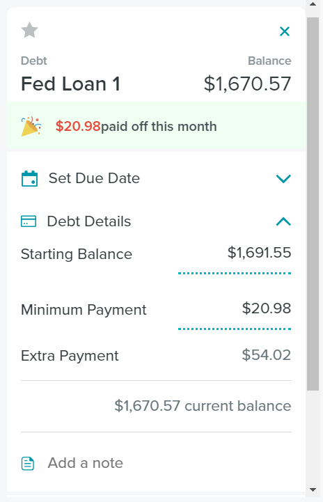
My least favorite thing about EveryDollar’s user experience isn’t a huge turn-off, but it does make the app difficult to use. Above is an example that uses one of my actual student loans. I wanted to show this part of the app, but I could not create an example for a future month because the app doesn’t let you “jump ahead” (or back) and create new debt line items. I get why because this is a Ramsey app, but I think it would be helpful to be able to update totals of future and past months. The app doesn’t have a place in the debt box to calculate interest, so you have to put the interest in as an “expense” transaction on the line item or adjust the “starting balance” number which feels messy. I do think the “extra payment” box is helpful. The little party hat (despite the spacing typo) makes the user feel accomplished in paying off debt. Still, all this is minimized by the lack of ability to manipulate the balance and add an interest rate because everything else about this tool is extremely accurate.
